UI
Marketing

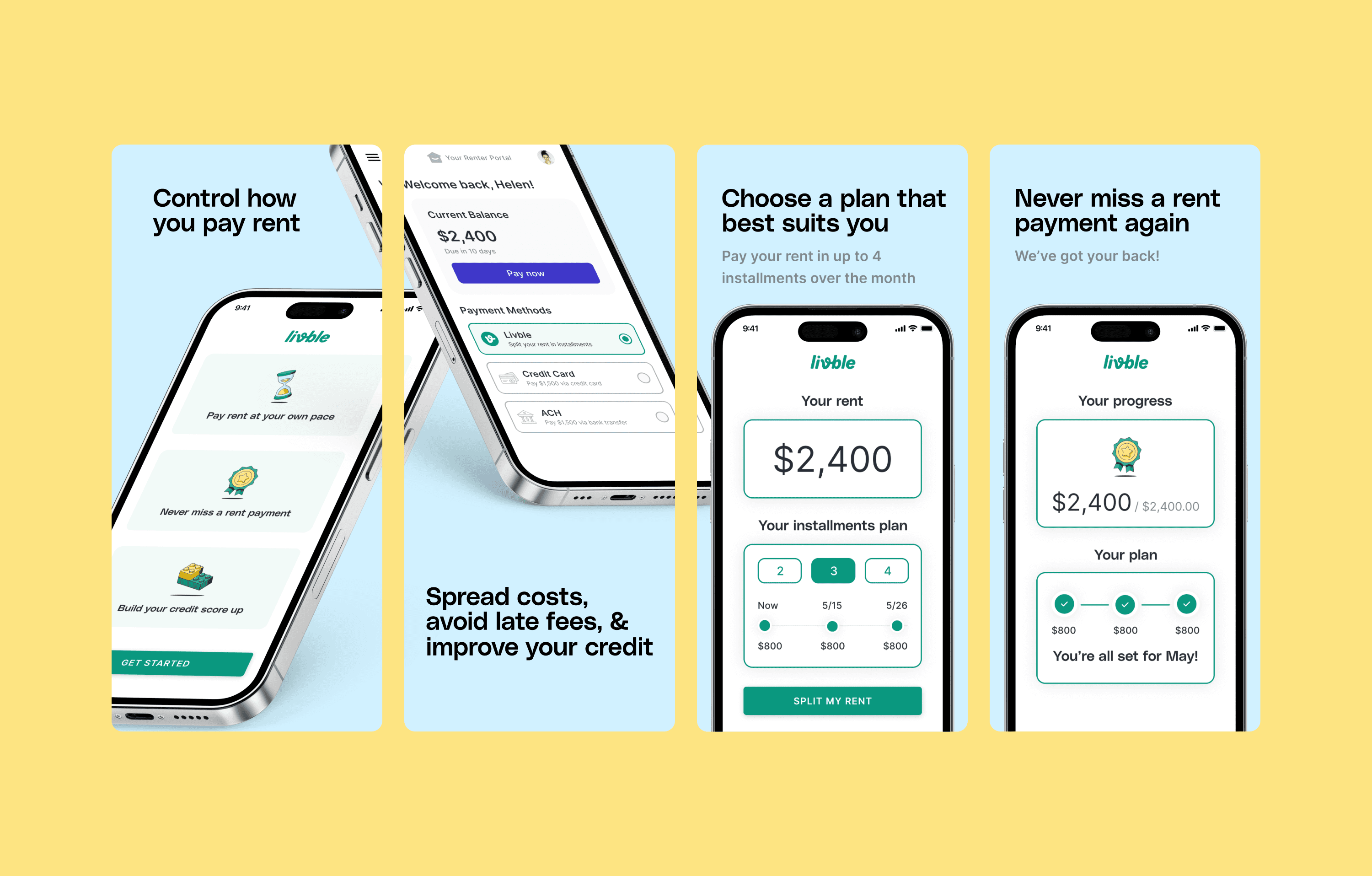
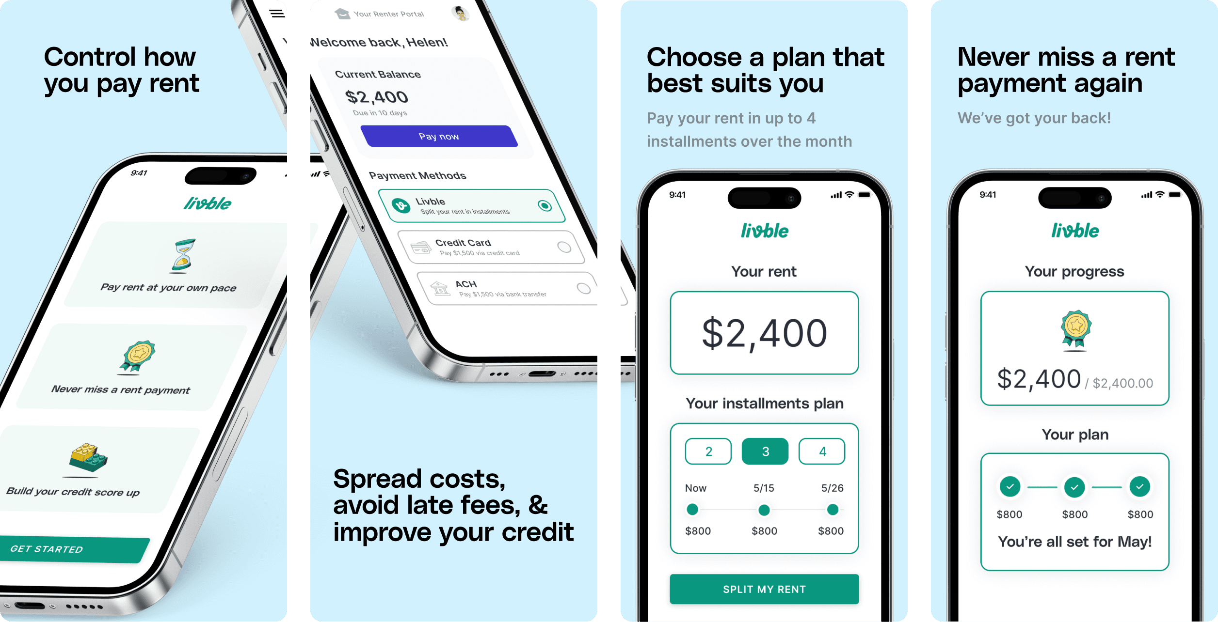
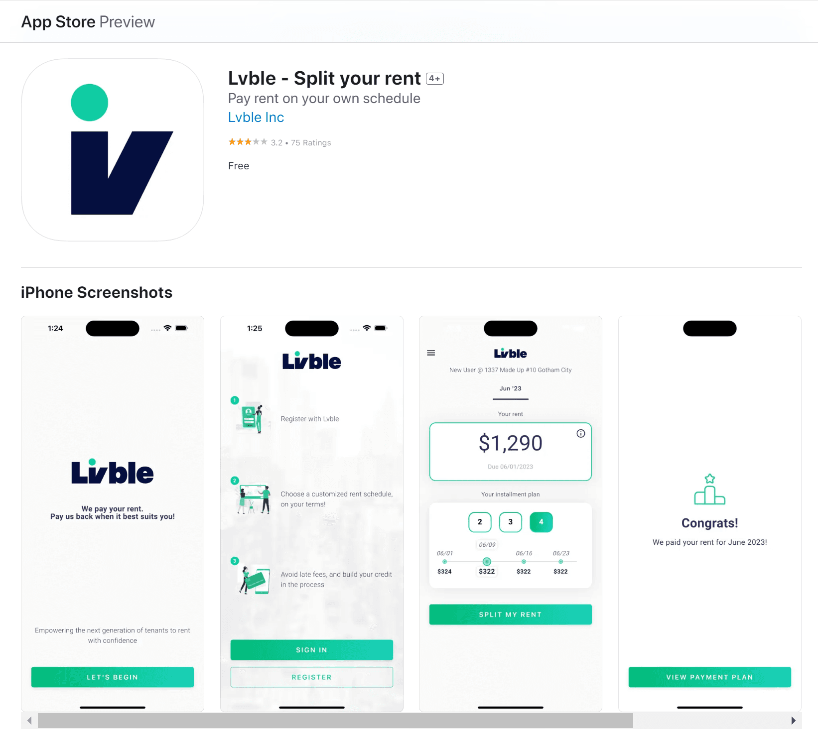
App Store Screenshots
Livble's app store page, the all-important first impression for potential renters, featured outdated screenshots that didn't effectively showcase the app's functionality. I took on the challenge of redesigning these previews to clearly communicate Livble's value proposition: giving renters control over rent payments. To achieve this, I created stylized mockups of the app, focusing on enlarging key interface elements. This ensures users can easily understand how Livble works, even when viewing the screenshots as thumbnails.
We're also going through a branding refresh right now, so you might notice some logo, font, and color differences!
New Design
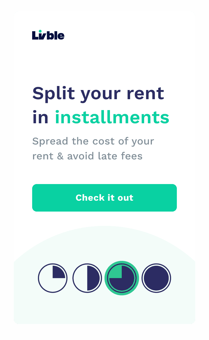
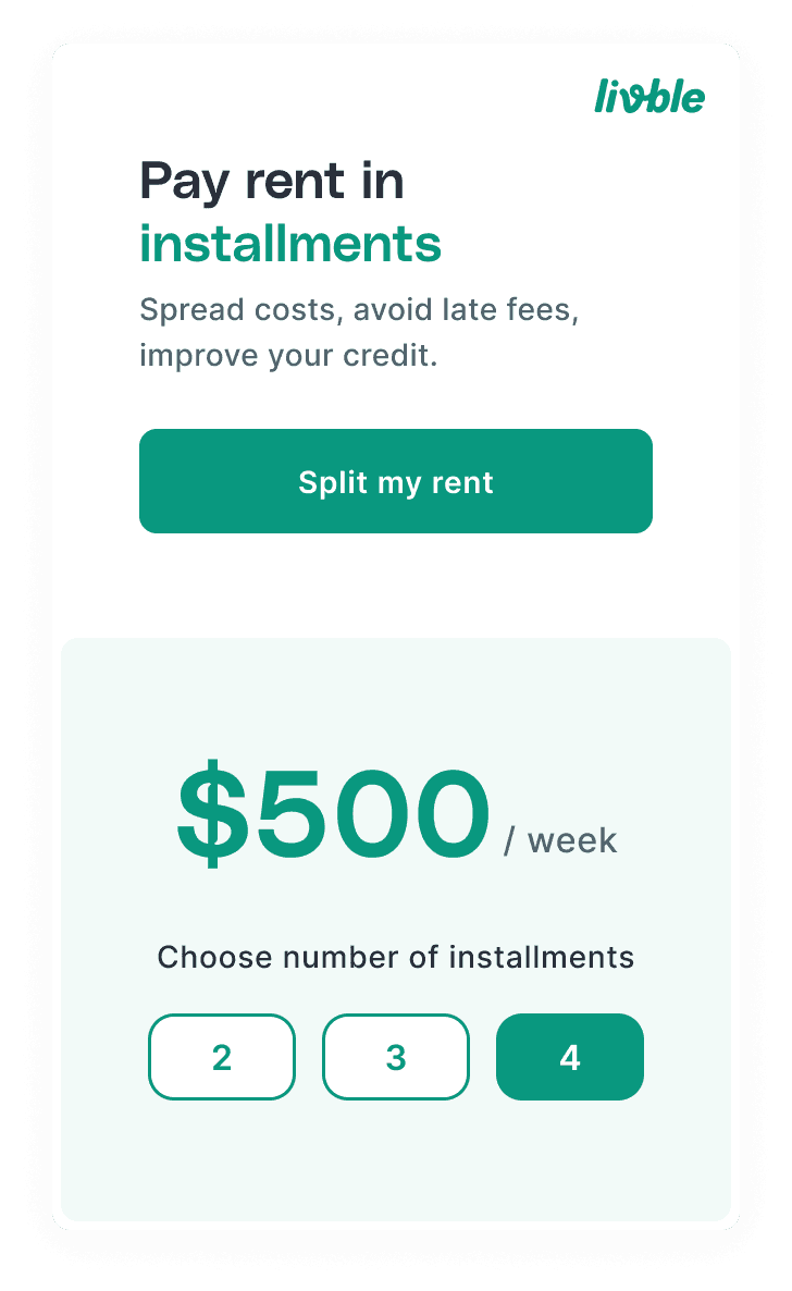
Old Design
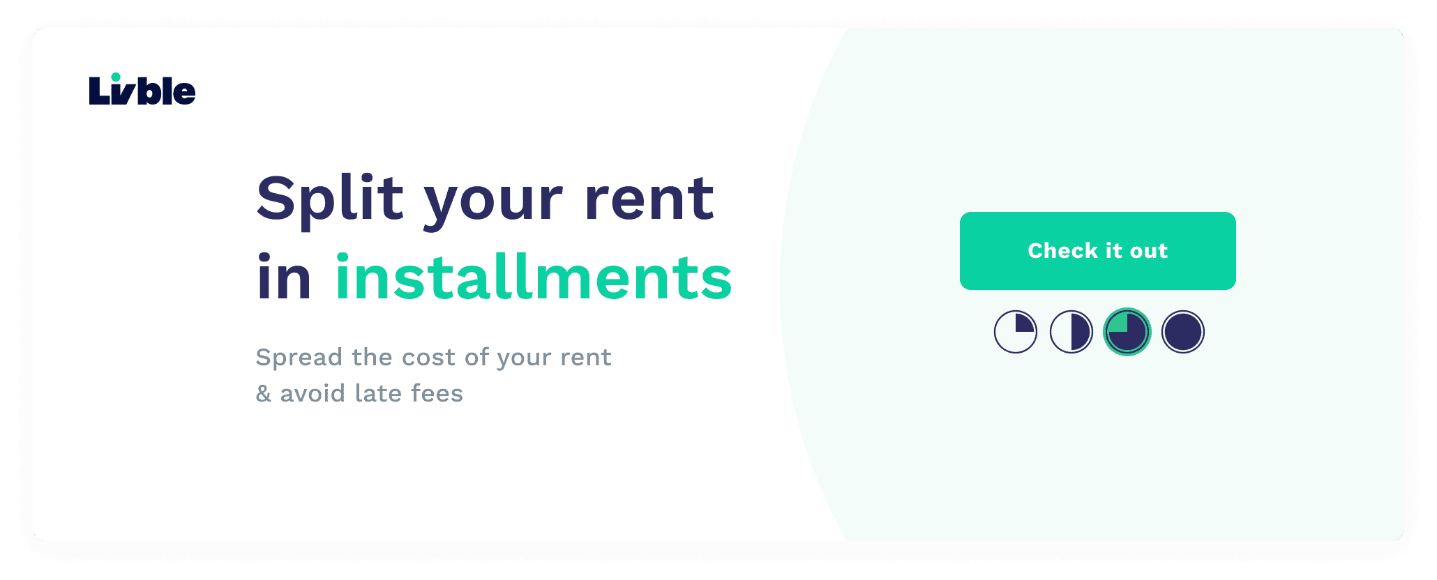
Renter Portal Widget
The widget is a renter's first exposure to Livble, appearing in their renter portal dashboard. The old design wasn't very clear about what Livble does, which is why it has a 10% clickthrough rate. I wanted to quickly show renters how Livble can help them split their rent payment into easy installments – they can choose 2, 3, or 4 payments. Since the widget is connected to the renter portal, we can even show them accurately how much each installment would cost. This makes it clear how Livble benefits renters and hopefully gets them to try the app. I plan to monitor the performance of this new widget and see how it performs once it launches.
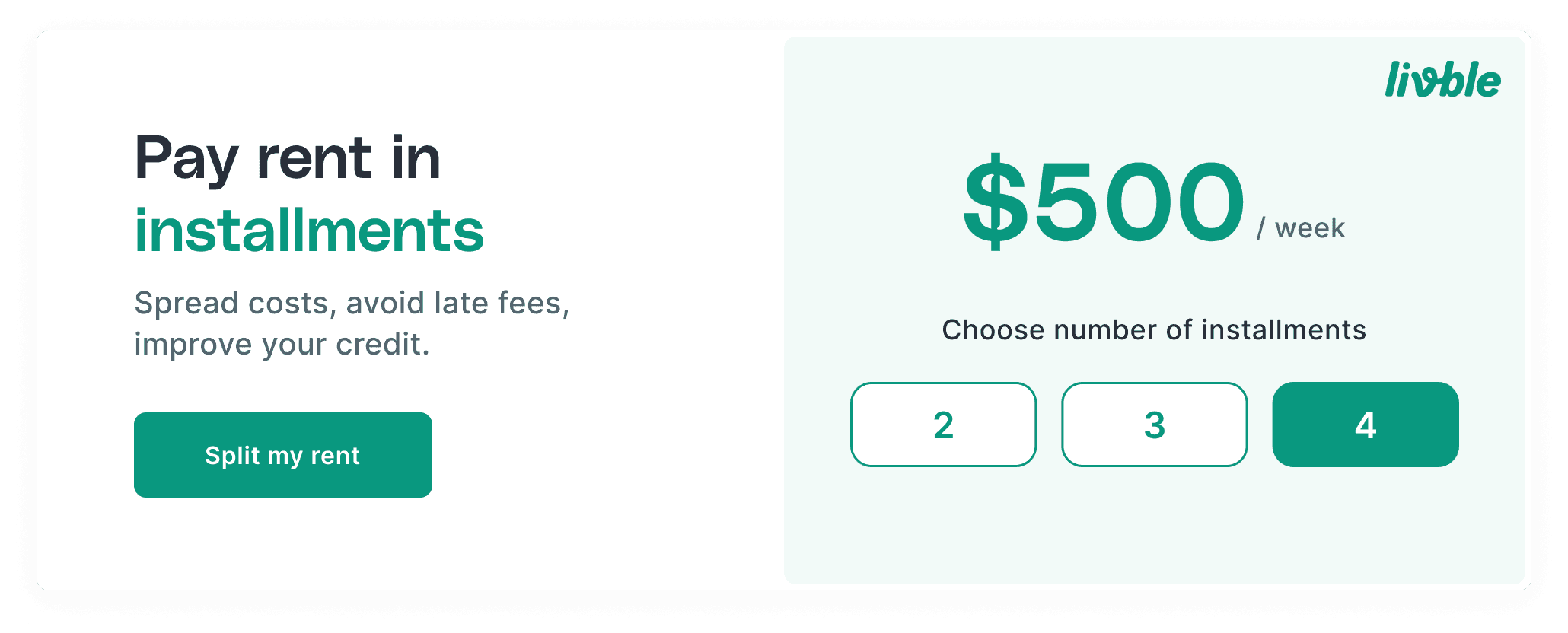
New Design