
UX
Research
Flow Optimization

Problem
Only 58% of users are completing their rental applications.
What is causing the drop-off? How can we improve completion rates?
Working as the product designer on this project was a tremendously exciting opportunity. At the time, about 80% of our revenue stemmed from rental applications. Given the substantial volume involved, even a slight improvement of 1 or 2 percent in application completion rates would yield a substantial boost to the company's overall revenue.
Results
Completion rates increased by 28%
Monthly transactional revenue increased by $100K
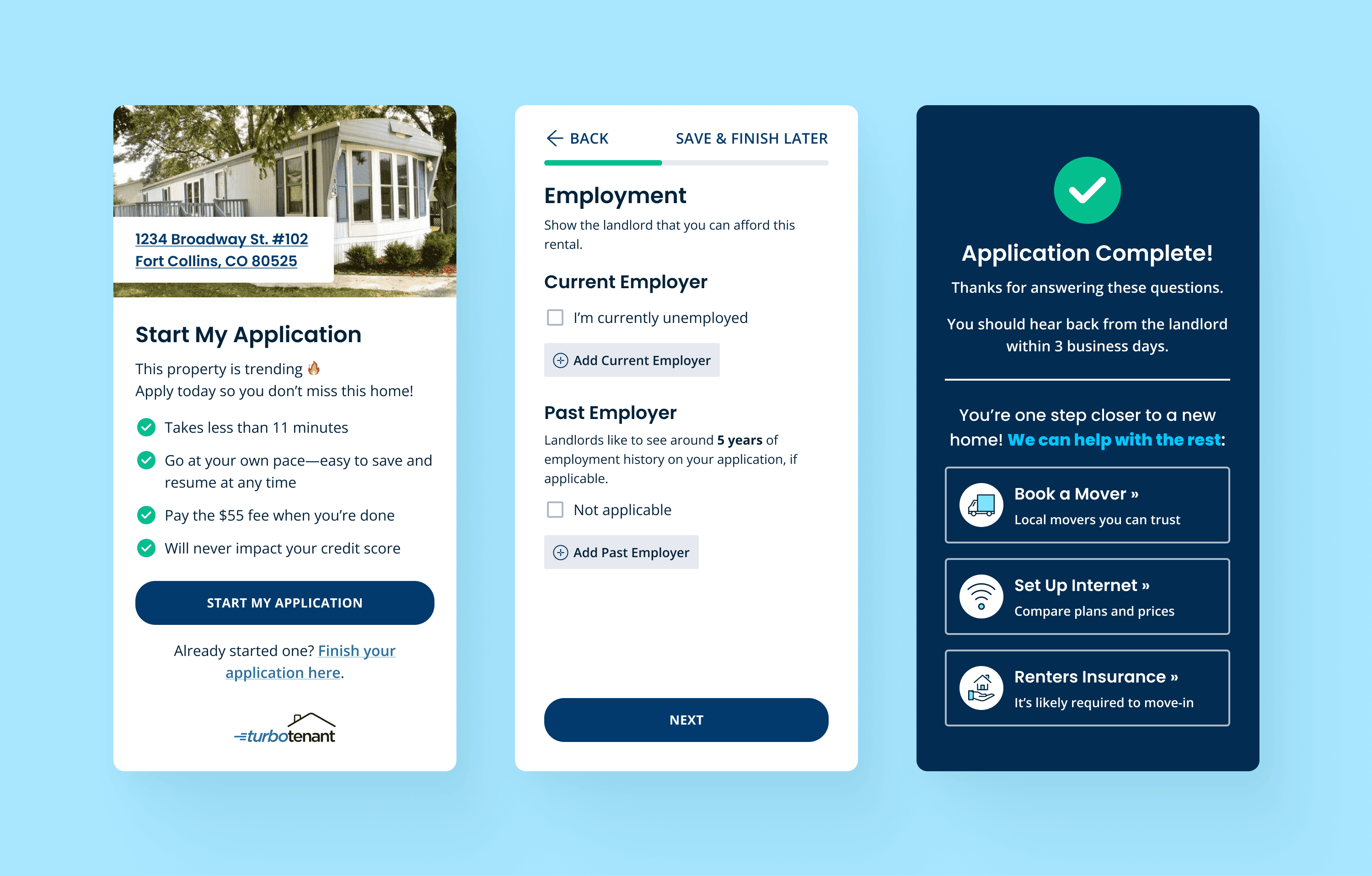
Final Designs
Research
To get a better context of the problem, I:
Watched Hotjar recordings to see applicant behavior
Interviewed landlords about their application/screening experiences with TurboTenant
Perused Intercom conversations on the topic of application troubleshooting
Collaborated with the product manager to analyze data to identify areas of improvement in the flow
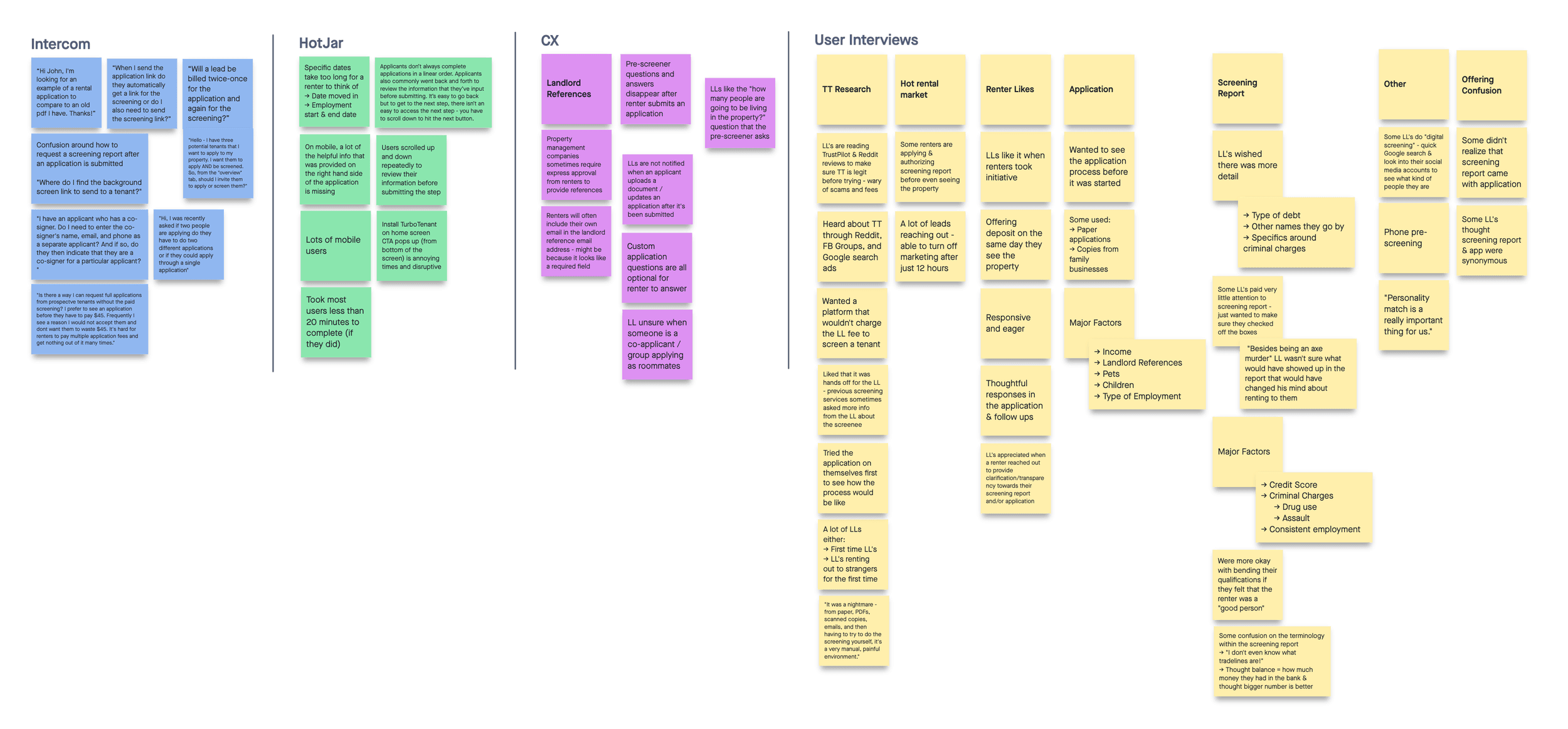
Over 75% of renters are on mobile.
Our landlord users, on the other hand, predominantly rely on desktop. Consequently, the mobile experience has been historically lacking and overlooked.
The code in this part of the product hadn’t been updated in a long time and was rife with bugs, inconsistent spacing, and old styling. This was confirmed from the engineers’ end.
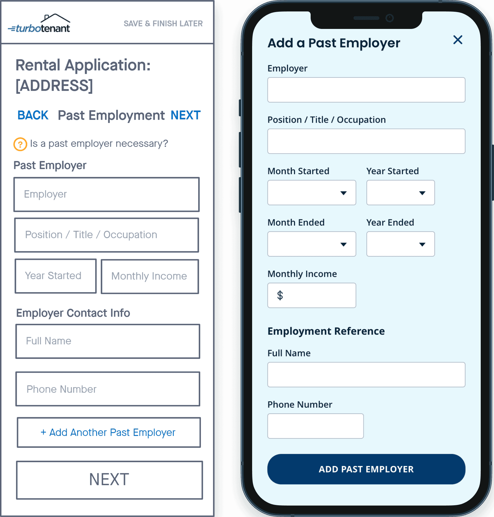
In some steps, renters were encouraged to provide as much historical information as possible to offer landlords a comprehensive overview. However, whenever an additional entry was added, the form fields would duplicate, resulting in the page becoming even more unwieldy.
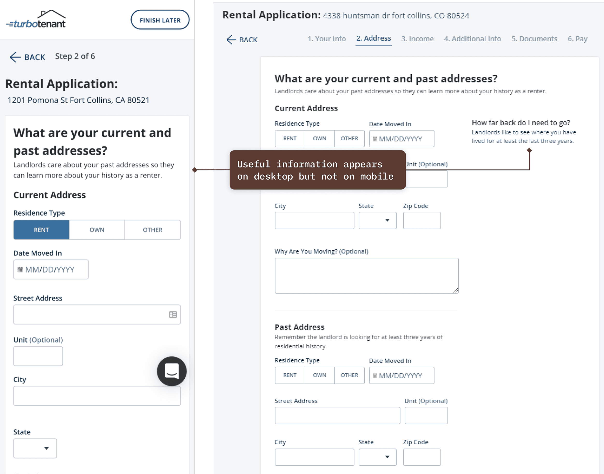
The information provided in the desktop experience differed from the mobile experience.
On the desktop, there included some helpful information that provided renters with guidance on how to fill out the application. On mobile, this information was missing. We documented what guidance was included and made decisions about what to include and exclude in the updated design.
Renters spent a significant amount of time scrolling through the application.
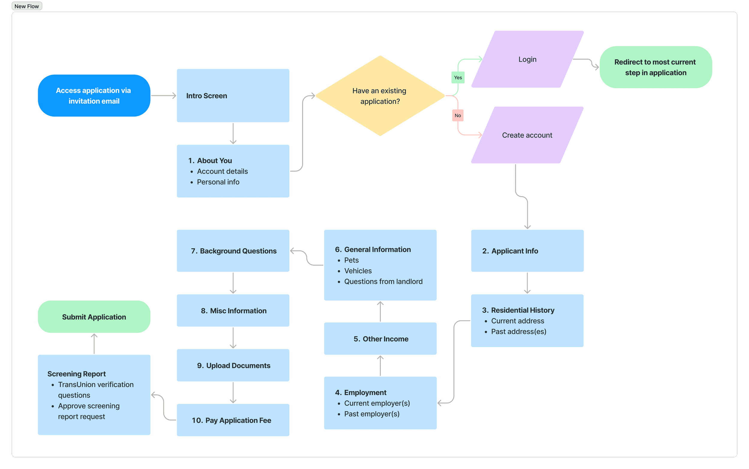
Despite the application flow consisting of just 6 steps, each step is remarkably long, with 2-3 distinct sections. As a result, renters had to excessively scroll to complete each step.
Furthermore, we observed from Hotjar recordings that renters spent significant time reviewing the info they just entered before going to the next step, further contributing to the excessive scrolling.
Renters frequently completed the application in a non-linear manner, going back and forth between steps to add/modify info. Because we didn't save their input automatically or provide warnings about losing unsaved changes, renters lost their info when they returned to the step, which created a lot of frustration.

Solution
Renters
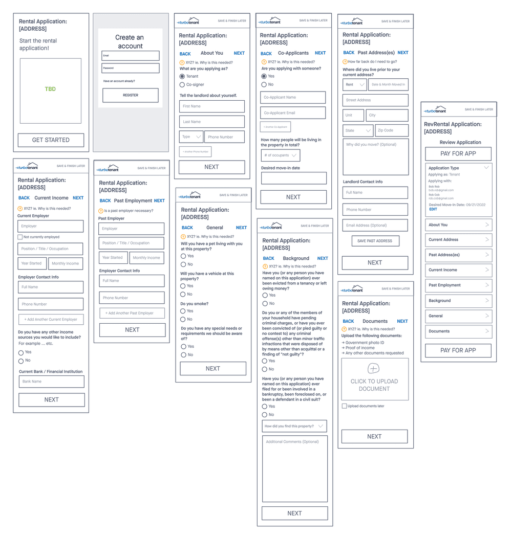
Split the flow into shorter, more concise steps
Opted for a full-screen view, removing the card layout to give everything more breathing room
Implement a condensed summary view for easier reviewing and to reduce page length
Substituted the step counter (e.g. step 1 of 6) with a progress bar for better visual representation
Implement Apple Pay / Google Pay for more convenient payment
Update flow with new styling
Landlords
Create a demo application experience so landlords know what to expect after inviting a renter to apply
Added some missing questions to the application
Changes
Despite splitting the steps to have only one section per step, there remained a considerable number of form fields to handle, especially when renters had multiple entries to add.
To address this, I chose to implement an 'add' modal for entries with the most form fields. After adding an entry, it would be displayed in the summary view when renters returned to the step.
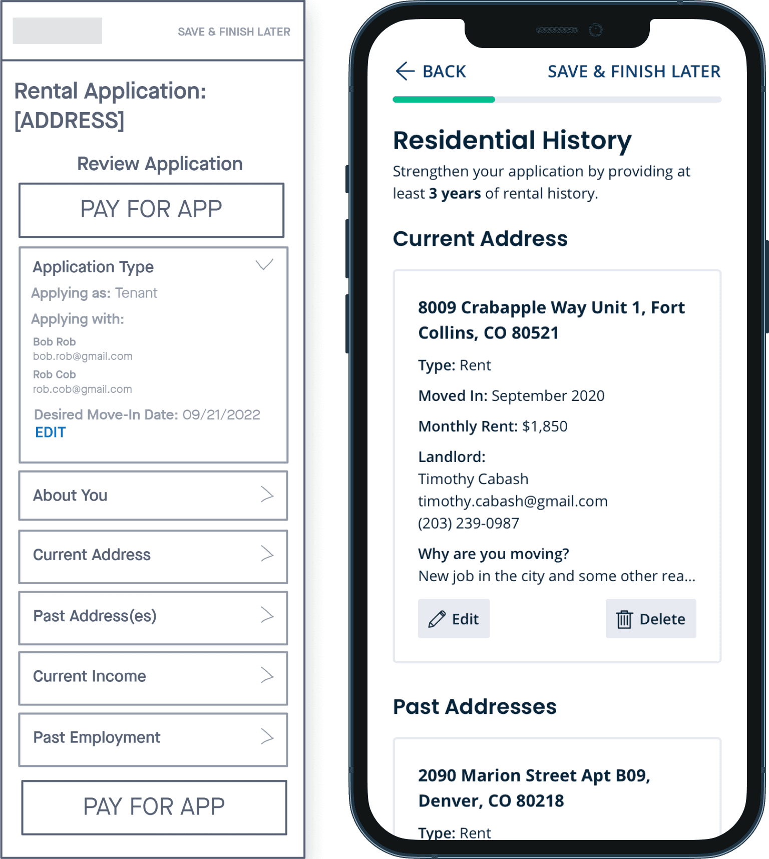
Initially, I had envisioned an accordion-styled summary view at the end, enabling users to review all the information they entered at each step before making payment.
However, this approach proved to be cumbersome and added an extra step. I removed it and instead implemented a condensed summary view within each step, providing users with the opportunity to review and finalize the information more seamlessly.
Next Steps
Renters
Implement social sign-in to reduce friction in the account creation step - Completed ✅
Improve all adjacent flows with new design components & styling - Completed ✅
A/B test the intro screen to further reduce drop-off rates - In Progress 🔵
Landlords
Improve completed application view on landlord UI side for easier reviewing - Completed ✅
Implement a setting that allows landlords to toggle the inclusion of certain background questions that appear in the application by default, taking into account state regulations where such questions are prohibited - Completed ✅